AMP Electric, LLC
AMP Electric, LLC
Designed screens for a company with zero online presence
Preparing a small business for the internet
I researched and designed responsive screens for Amp Electric, a 20-year-old company lacking an online presence. Enhancing their online visibility will attract new clients and potential employees, build credibility, and improve client experience and business efficiency.
-
End-to-end product designer
-
7 weeks (2023)
-
User Interviews
Competitive Research
Feature Roadmap
Sitemap
User + Task Flows
Wireframes
Branding
Design System
Usability Test Findings
Overview
The Problem
Lack of online presence limits them to other opportunities
The business relies on regular clients and word of mouth, new clients are hard to come by
The owner will be building the site independently
Proposed Solutions
Design a website to allow the stakeholders to open up new opportunities
Ensure a seamless booking and inquiry process
Design screens that are user-friendly and easy to use for the owner to build
End Result
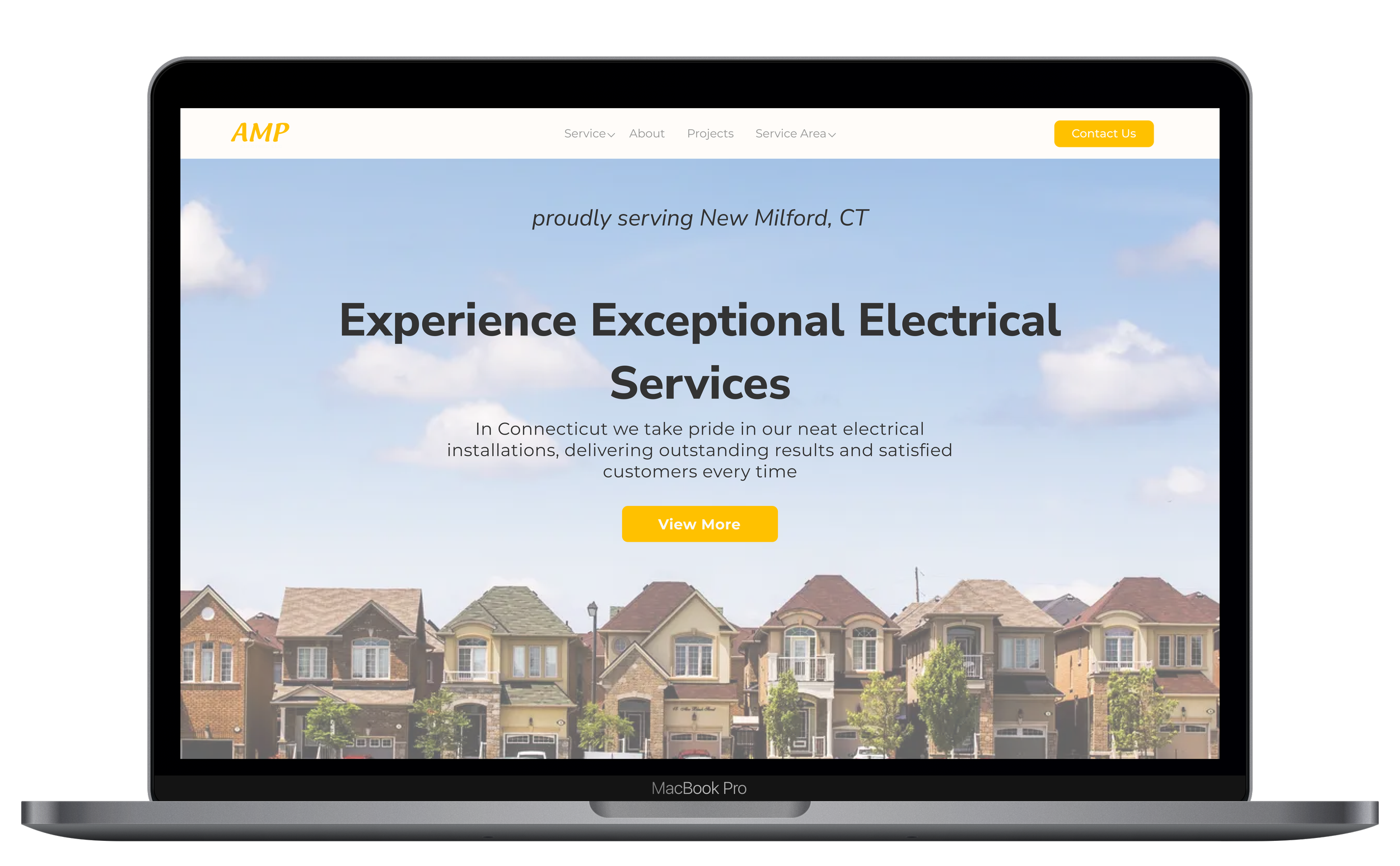
Final design showcase
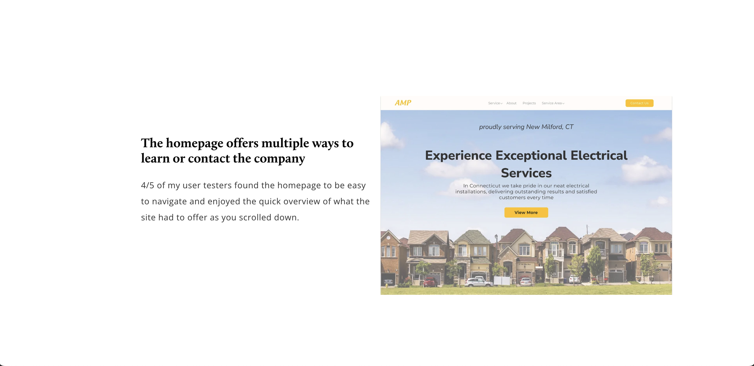
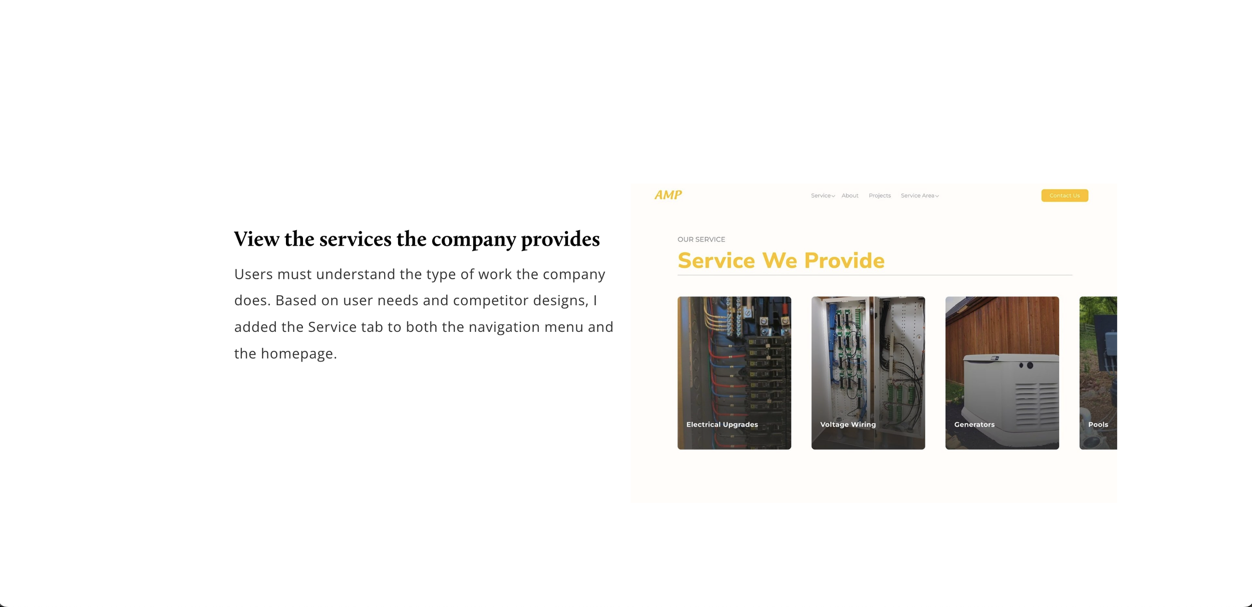
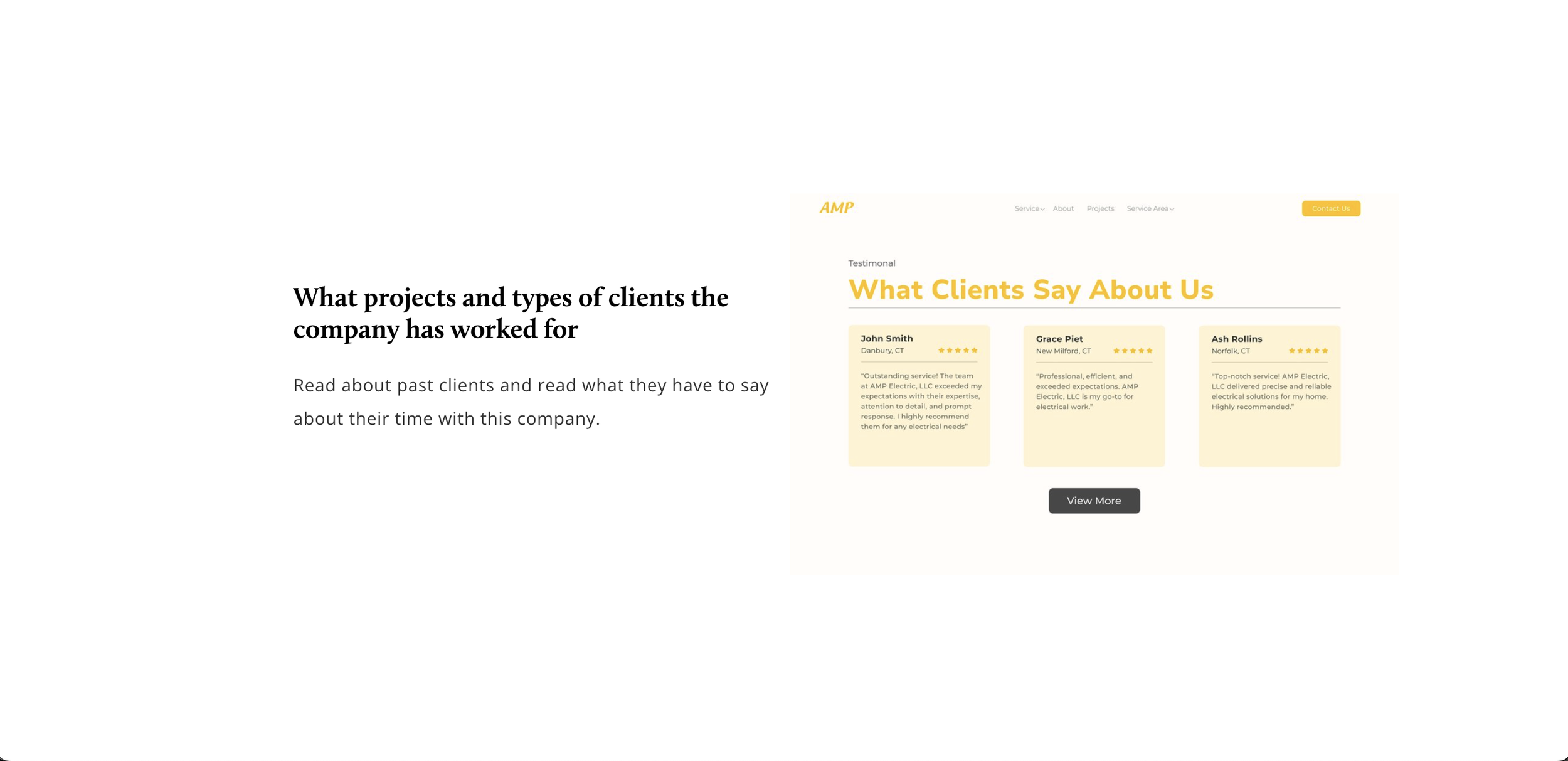
In about 7 weeks, I researched and designed a responsive website for my client, running a small electrical company. The website supports my client by meeting users' needs, providing online information about the company, and an easy way to get in touch.

Research
I started my research with one-on-one interviews to understand users’ journeys when searching for an electrician
To get out of my comfort zone my goal was to interview strangers, I sent out surveys on various social media platforms and my school's discord, I received no responses. As a last resort, I turned to family and friends, interviewing 5 individuals who had hired electricians.
Objectives
Decision-making factors in selecting an electrician.
Learn the reasons for searching for an electrician.
Understand pain points in the hiring process.
Affinity Map
I learned users are looking for convenience and availability in their hiring process
I was relieved that my assumptions were wrong. It’s a nice feeling when you reveal how your users’ experiences are different from your assumptions because that’s how they should be. It shows me the importance of conducting user interviews!
My assumptions:
Credentials
What services do they provide
Reading reviews
What users looked for:
Availability (who called back to them first)
Can they do the service
Local (Are they in the area? Are they close by?)
Findings:
5/5
5/5
4/5
Users felt it was important that the contractors were local and nearby, meaning they were close and convenient.
Users received referrals from people they know or other contractors. Listened to what their experience was like.
Users do additional research online about the company helped them feel secure and educated in their decisions.
To understand how other companies use their website, I conducted a competitive analysis
It honestly took some time to find a company with a decent online presence. I ended up choosing 2 local and 2 non-local companies with a strong online presence.
Findings:
Various CTA buttons throughout the site to get clients to get a quote, or contact the company.
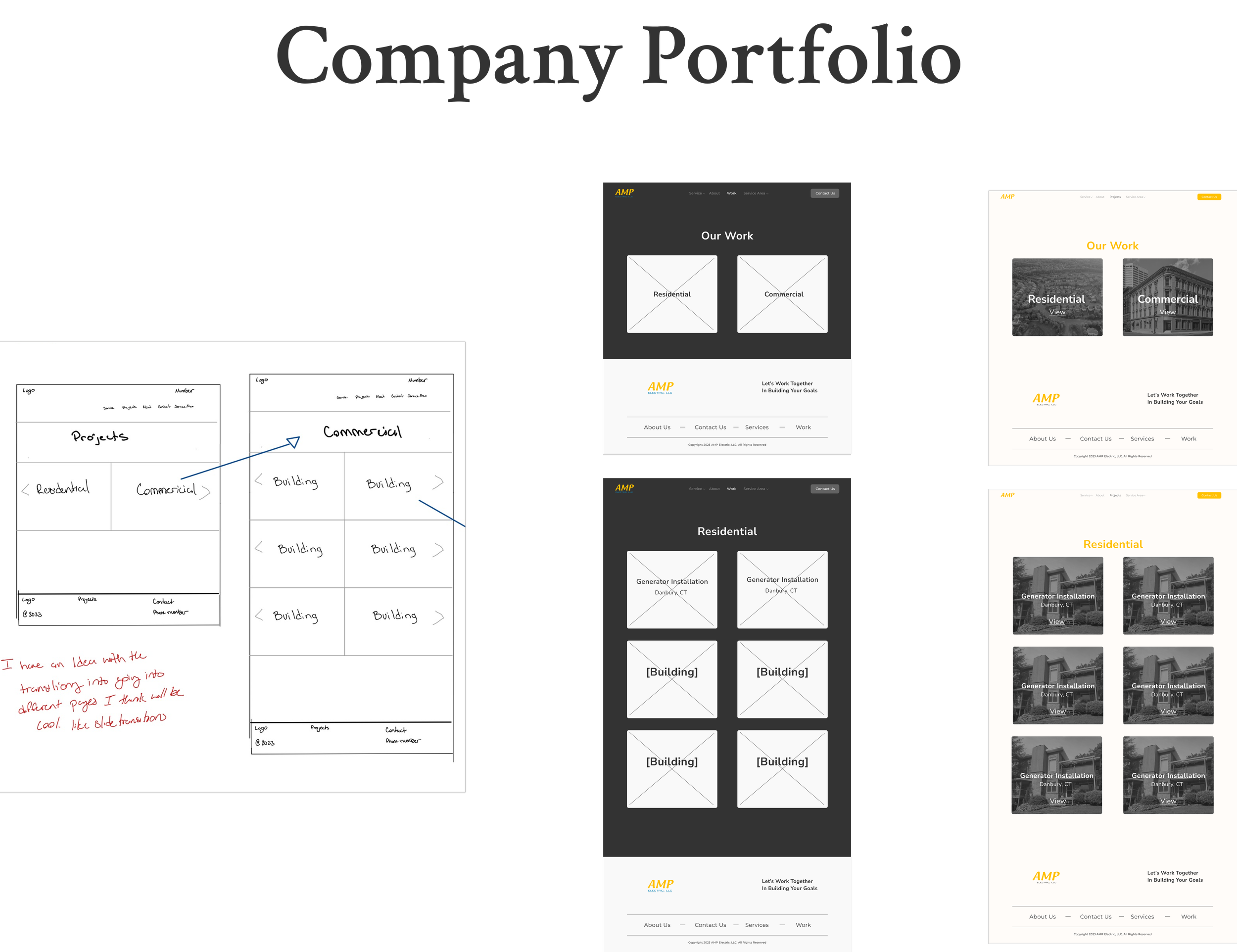
View what type of jobs they have to offer, and what projects they have completed.
Read about clients’ experiences with the company.
Main Takeaways:
Are they available right now, how quickly will they get back to me?
Are they local? Will they have to drive far? How convenient are they?
How experienced is the company, what do they do and do they fit my needs?
How might we empower people to confidently choose the right electrician for their needs?
Ideate
After brainstorming I inserted the ideas into a user priority and feasibility grid
I had a lot of great ideas but I couldn’t do them all. Using the grid helped dial down what I needed to focus on based on my users’ needs.
Chosen ideas, and how it will help my users:
Services you provide
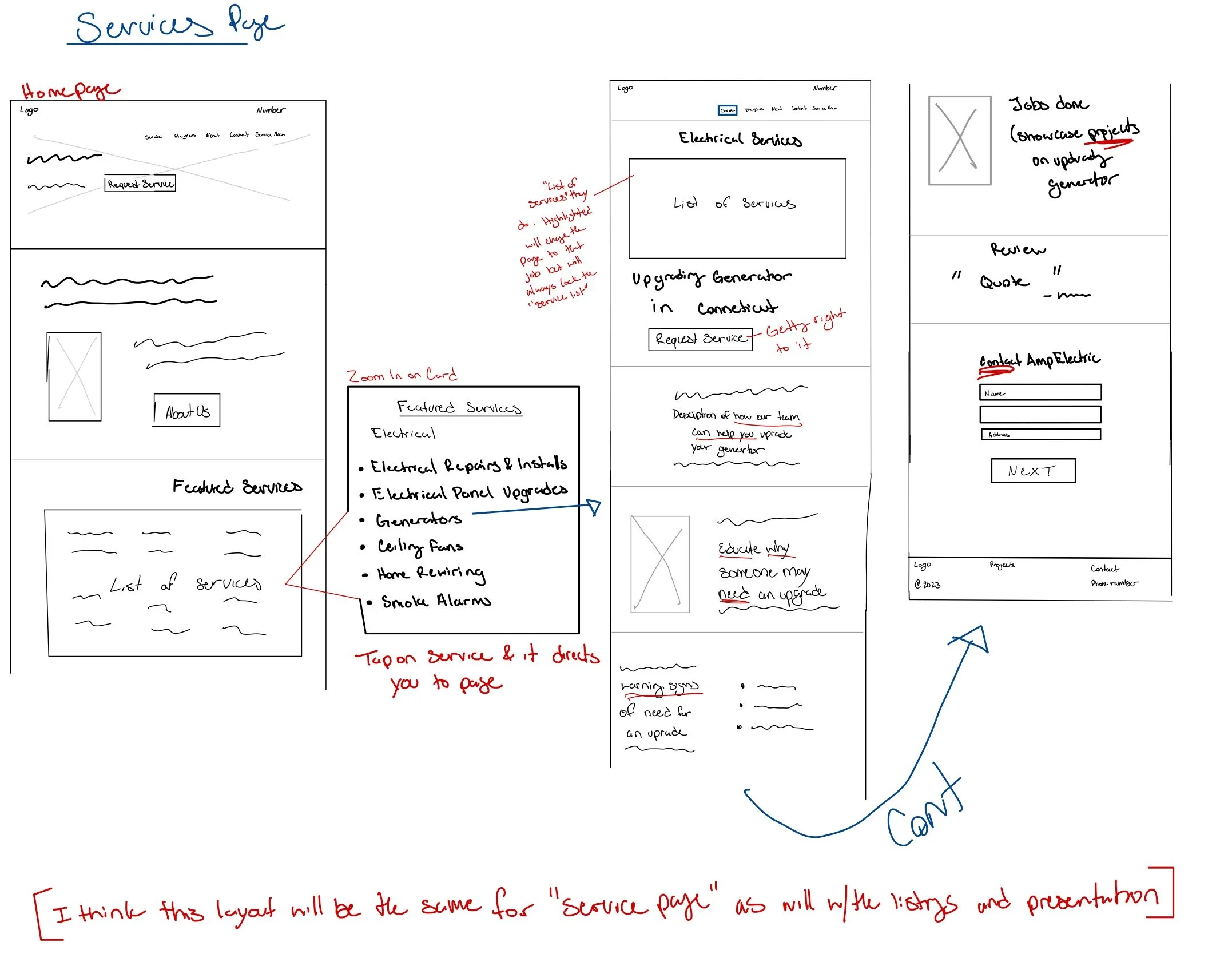
Listing services is crucial for users to understand the business's capabilities.
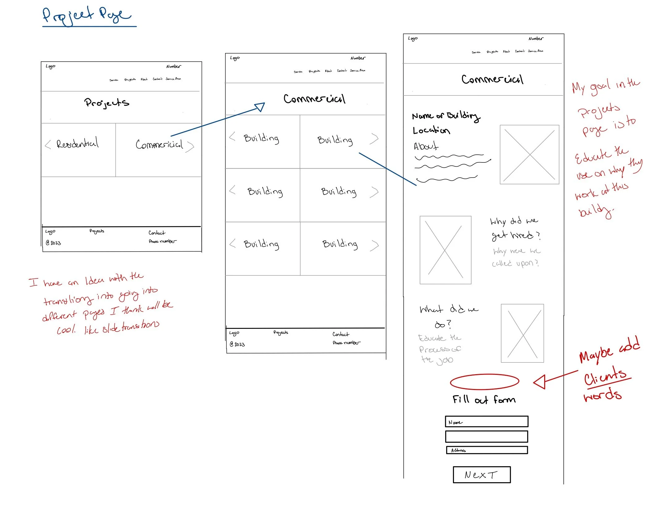
Showcase completed projects
Showcasing a key project satisfies users' curiosity about the job and demonstrates the business's expertise.
Showcase client reviews
Client reviews add an extra layer of trust.
Evaluation the ideas based on user priority + feasibility
To help me recognize what features are a “must-have,” I put together a roadmap
I kept things simple by focusing only on the must-haves and nice-to-haves to make sure the website launch goes smoothly.
Built a feature roadmap to help me organize the necessary features for launch
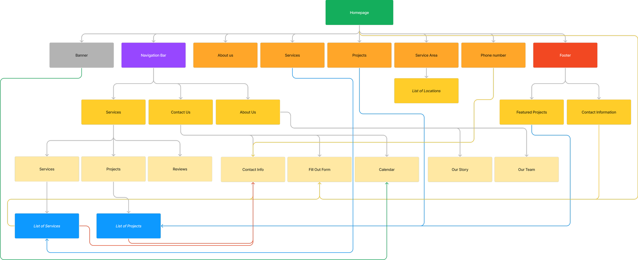
Referencing competitors sites to learn the best way to map out AMP’s website
To draft my client's sitemap I referenced Davis & Green and Longchamps Electric's website. I admired how Longchamps kept their site simple, while Davis & Green loaded up on info.
Design Phase
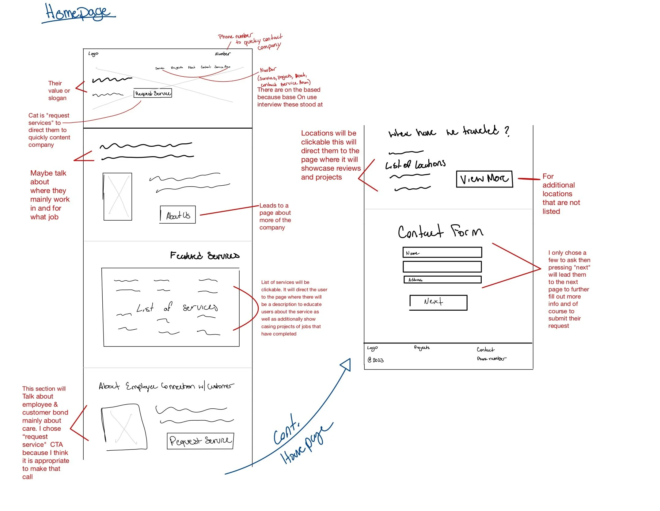
Before sketching, I gathered a lot of references from different websites to understand common design trends
Viewing these sites I thought about what elements they used, and how they were implemented. As I was sketching the low-fi wireframes I jotted down my notes/thoughts:
Why did I add this (reference and user needs)
How could this help my users
When would this element be used
Additional thoughts that I didn’t think of before
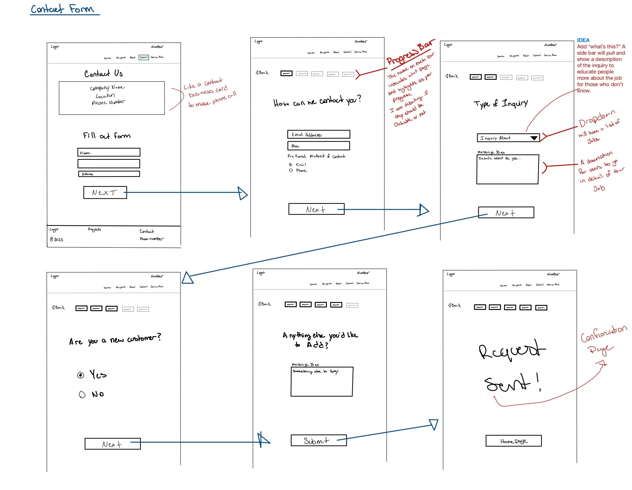
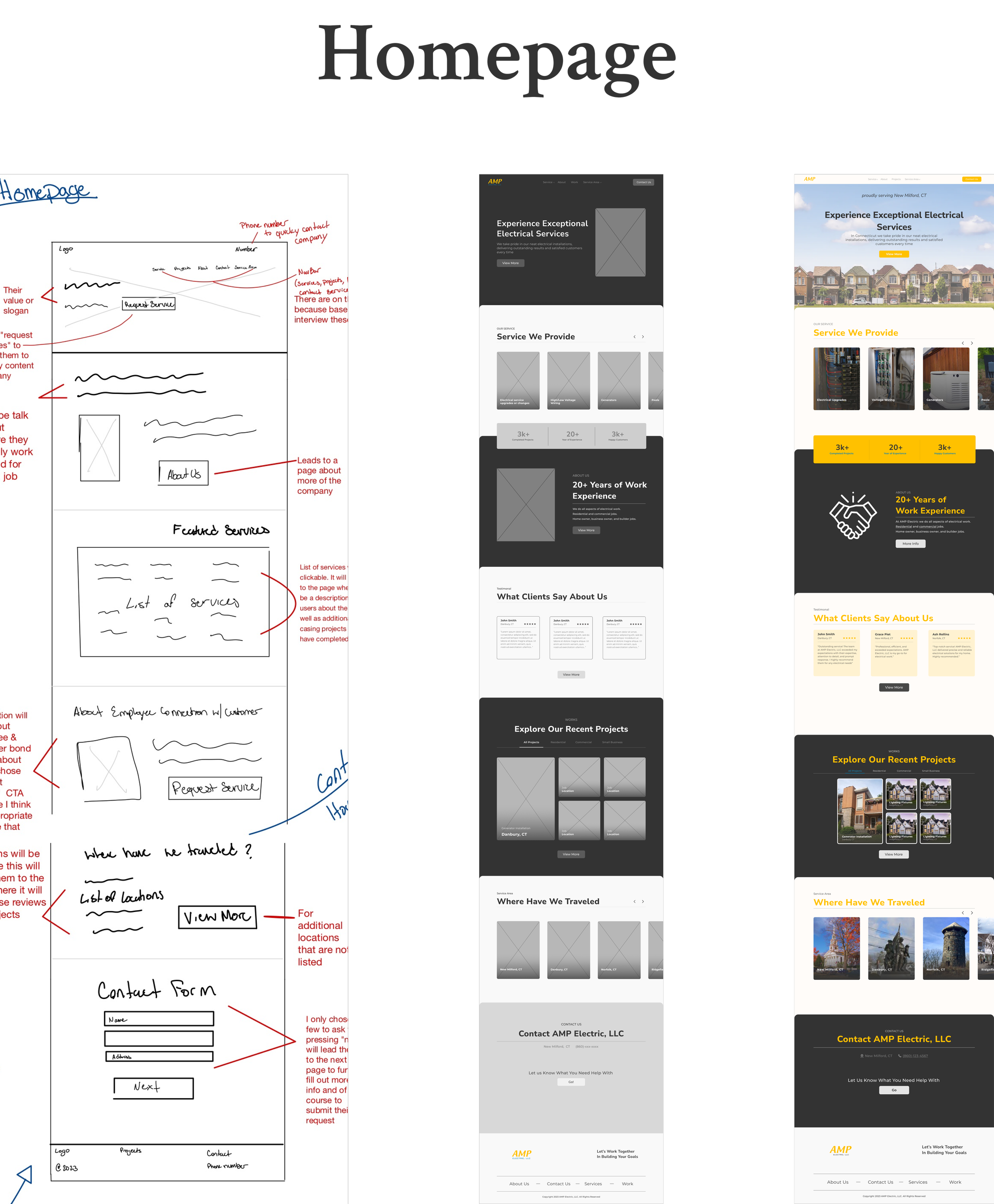
Sketching and wireframes
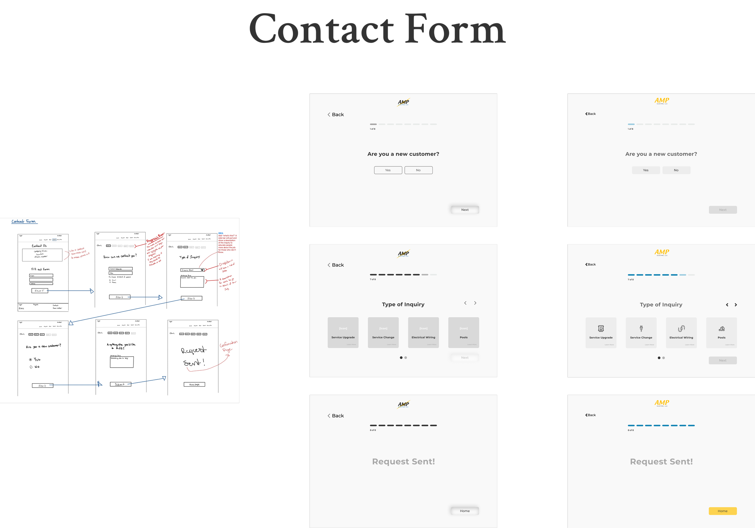
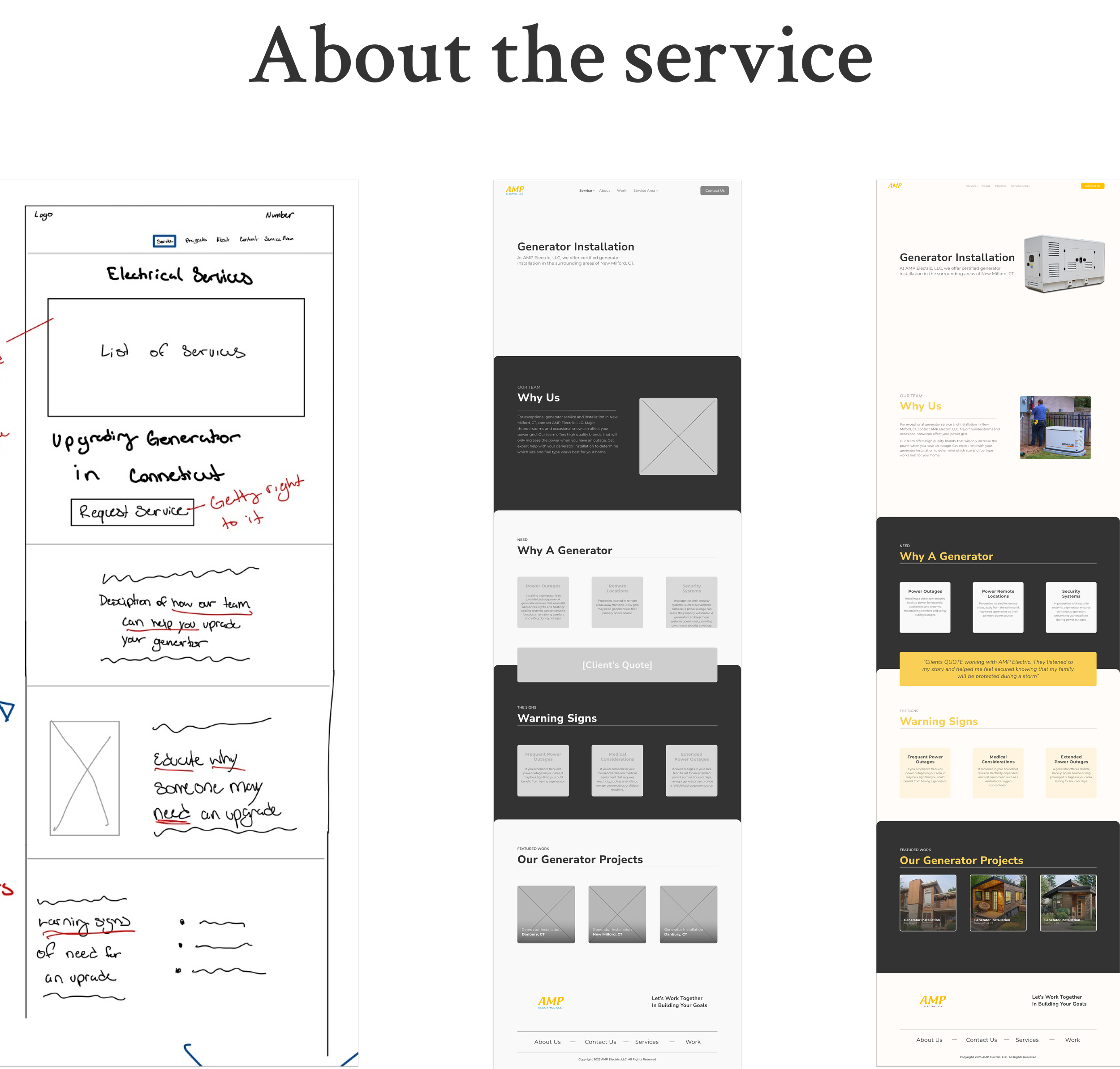
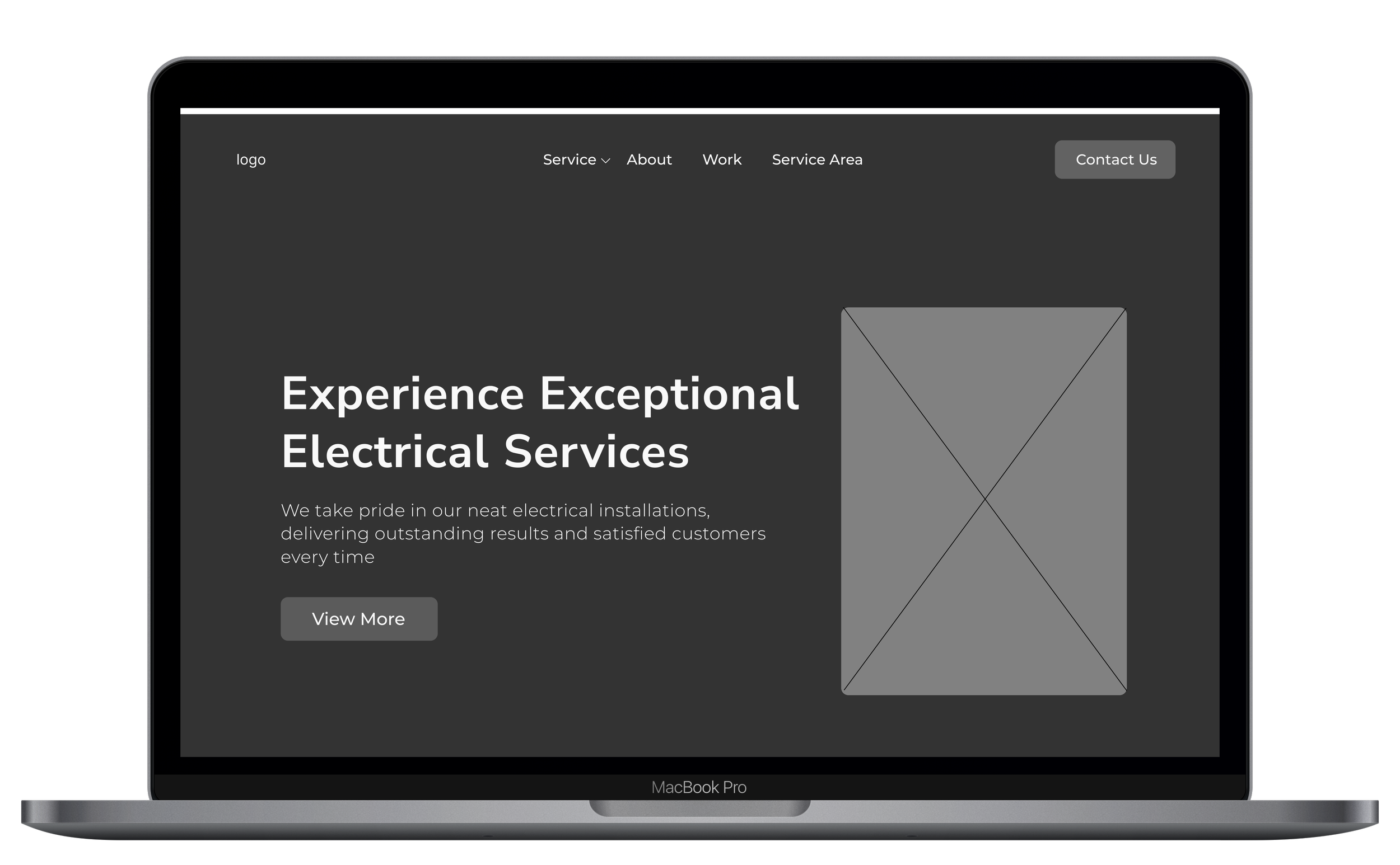
I created low-fi wireframes, then mid-fi wireframes, then finally high-fi wireframes.
Liked the “Team” section in the About page. Get to see who they may work with or in the future.
- User Tester
Having learned from the kick-off meeting that the owner had no future plans on making changes to the logo, the redesign ended up being some light changes
I wanted to show some love, by keeping their logo similar to the original in the redesign. As well as keeping in mind to make sure it’s accessible and fits right in with the website.
Accessibility Notes:
Lots of unnecessary lines in the original logo.
The yellow-on-yellow blends in making it visually difficult to view.
Took out the “lighting” illustration in the background to let the company name stand out.
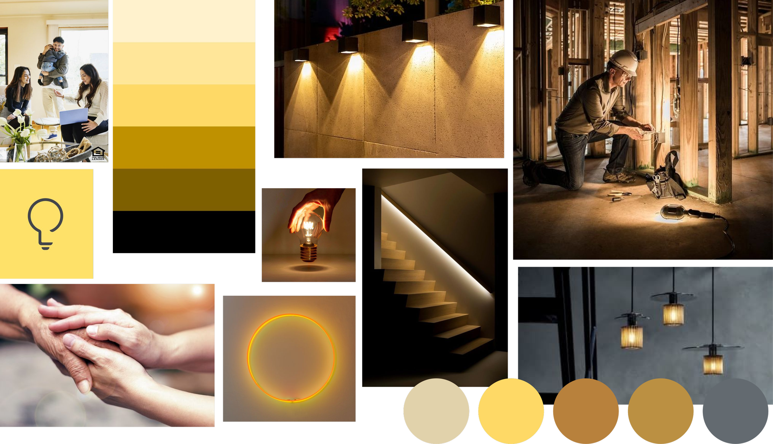
To understand how my client wants their company to make clients feel, I asked what words best described their company
Listed three visual brand values:
Trustworthy (trust us with your care in our hands)
Friendly (open and ready to listen)
Committed (serious about the job)
Visual brand board
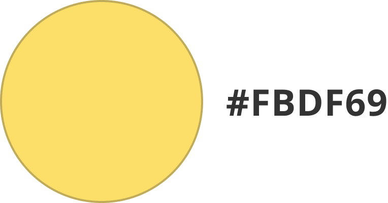
I followed the company’s brand colors, however I adjusted the shade in order to make the website accesible
The primary accent color was yellow in the company’s logo. However, the shade of yellow is too light and not accessible for the website.
I used a shade of white as the primary background, and a shade of black to separate the page sections.
Original accent color:
Website color palette:
Accent
Primary
Background
Testing
Usability Testing
Tasks for the test:
Read about the company
Learn about the services the company provides
Fill out the contact form for your project
My goal was to make sure:
Is it difficult to fill out the contact form?
Is there anything else the users would want to know about in the services section?
Is it clear to find and read the about section of the company?
Testing the prototype
Conducted moderated testing with 5 people (in-person) who have had experience with searching for contractors online.
Before drafting the hi-fi wireframes, the mid-fi prototype testing allowed me to study the user’s scrolling and clicking gestures. This would help me reveal any consistent, or inconsistent paths for any needed adjustments.
Based on my testing goals the test was a success
After synthesizing the data from the user testing it revealed minimal usability issues. This gave me confidence in meeting my user needs.
100% of participants successfully completed all tasks, demonstrating the website's intuitive navigation and user-friendly interface.
Participants were able to locate information quickly and easily, thanks to clear labeling, logical site structure, and prominent CTA buttons.
Participants expressed general satisfaction with the website's design, describing it as "easy to use," "informative," and "professional." They appreciated the straightforward layout and the availability of relevant information.
Now I’m not done just yet, refining the UI was the cherry on top of this project
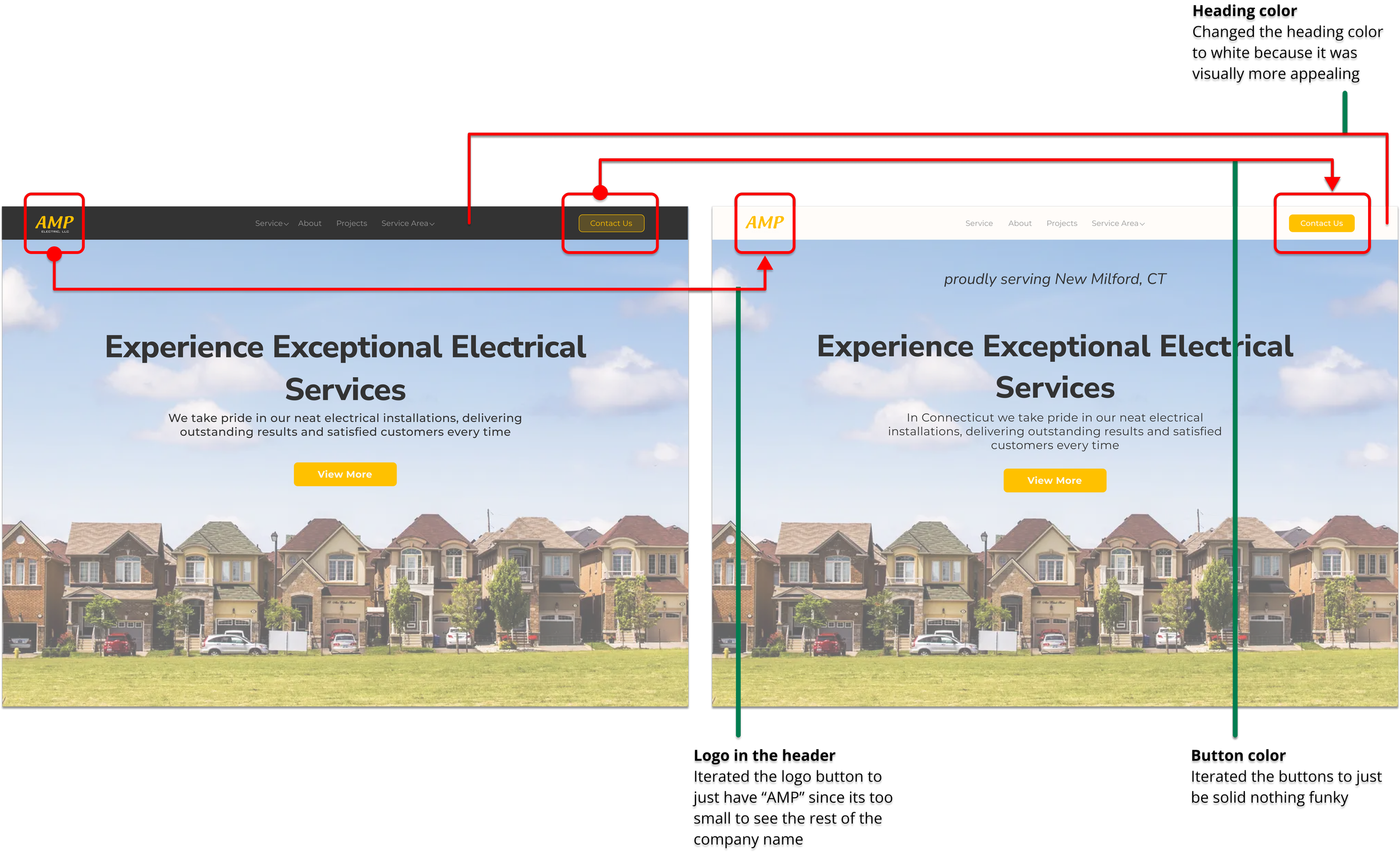
My testing was a success however there is still more work that needs to be done. I refined the UI based on my mentor’s feedback I made sure to iterate on the following:
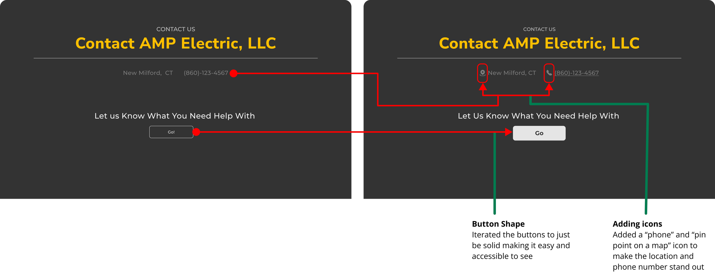
Fixed the button’s color to be solid and not transparent
Made the heading light and not dark to fit the theme of the website more
How usability might be improved
Issues to address for longer-term development:
Show the company’s availability (maybe via “Calendar”)
One of the main takeaways I completely neglected, was from my interviewee's findings. They hired their contractor because they accepted whoever called back first.
Display project time completion, or live est. time of completion
User patterns didn't mention project duration, this is personally inspired by time duration design trends from videos/films and delivery services. I see this as a potential future feature.
Reflecting
What I learned
Letting go and redesigning the logo with no attachments
Based on the meeting with my client, my heart couldn’t let me fully redesign the logo.
I limited myself, I should have fully redesigned the logo, offering my client options for both online presence and potential rebranding, whether the change is small or large.
Taking my time with the ideation process
Taking my time with the ideation process
As I was creating this case study, I realized I neglected one crucial user need which was “availability”.
Honestly, it’s quite disappointing because one of the main reasons my users hired their contractor was, “who called them back first” was the person they accepted.
