Helping users take control of their day
Show Up
Show Up
Show Up is based on a simple idea:
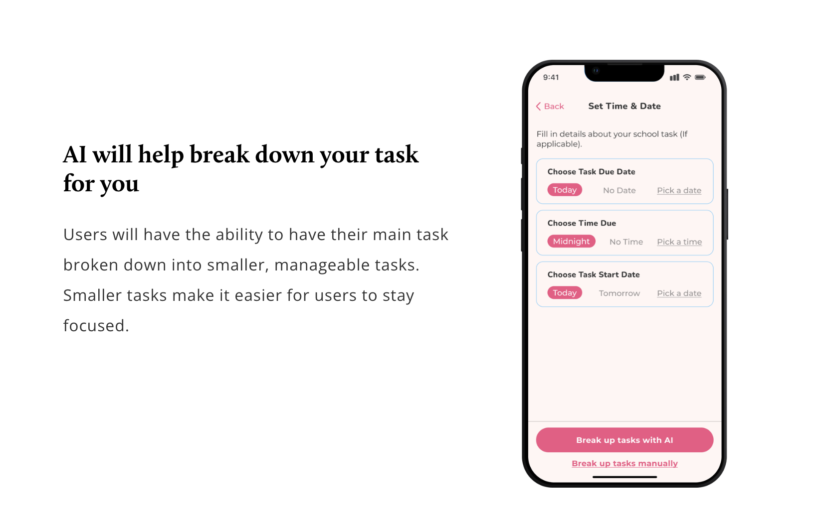
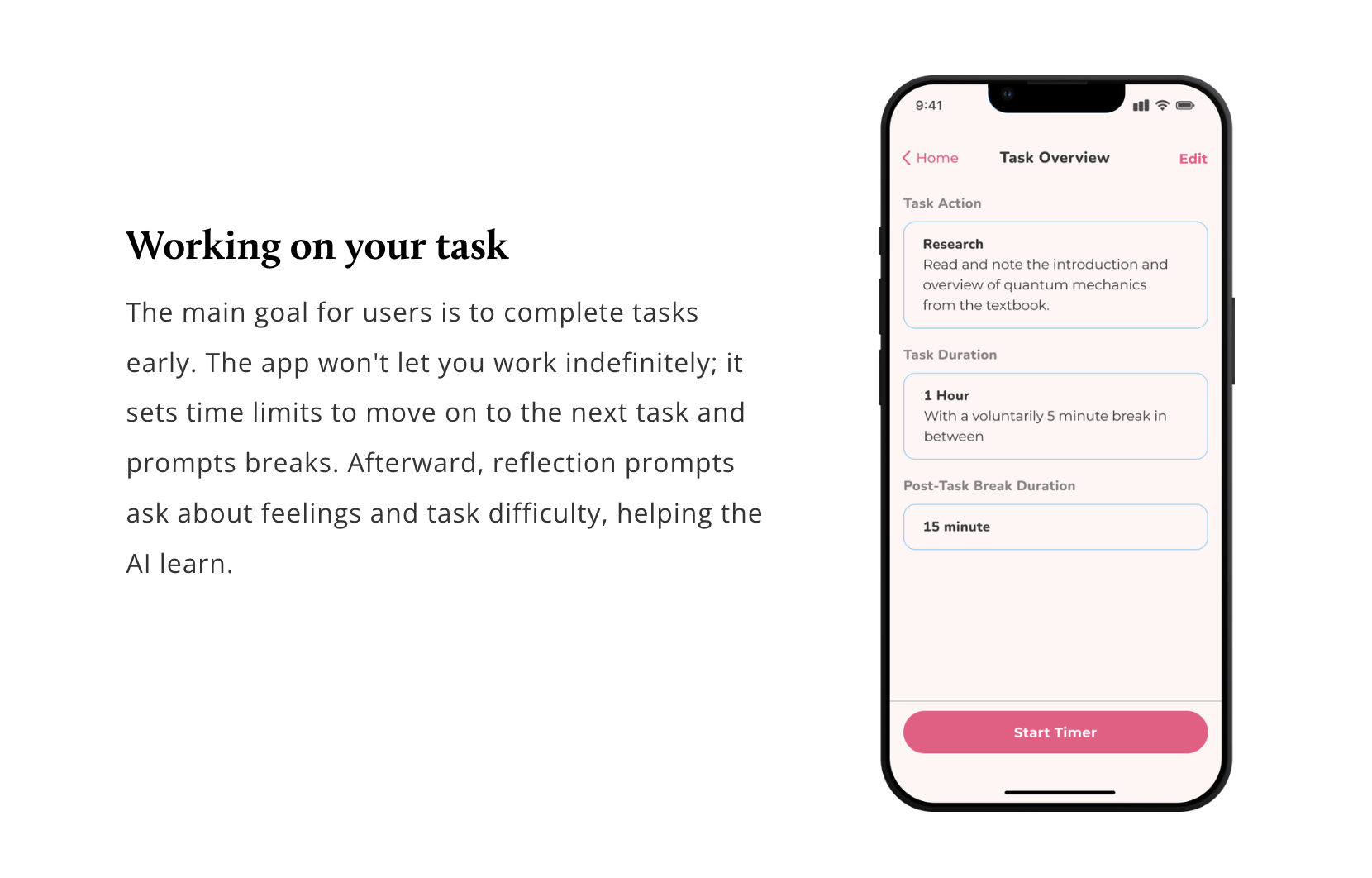
Making big tasks more approachable by using the 1-3-5 method. Our AI chops difficult tasks into bite-sized, manageable tasks, each with its own timer. It not only eases the workload, but also prevents burnout by setting breaks in between tasks.
-
End-to-end product designer
-
13 weeks (2023)
-
User Interviews
Deep Research
Competitive Research
User Journey Map
User + Task Flows
Wireframes
Design System
Usability Test Findings
Overview
Some students believe success demands sacrifices, which might seem one-sided. However, missing out on enjoyable moments and feeling gloomy isn't ideal. I believe students can prioritize without feeling trapped in the “should I or shouldn't I” sacrifice dilemma.
The Problem
Students face a tough balance between academics and personal life.
This challenge impacts their ability to manage time and tasks effectively.
In addition, it influences their ability to enjoy a well-rounded life experience.
Proposed Solutions
Make it easier by breaking down the tasks for them.
Set timed activities and breaks.
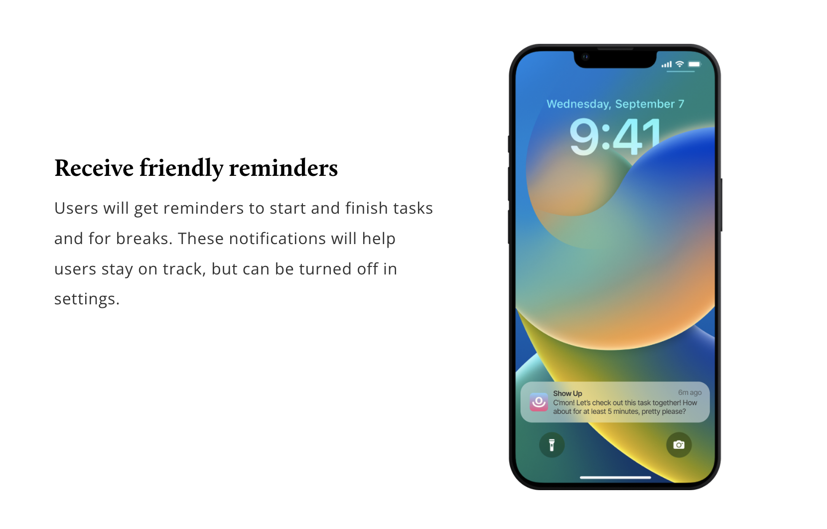
Provide notification reminders.
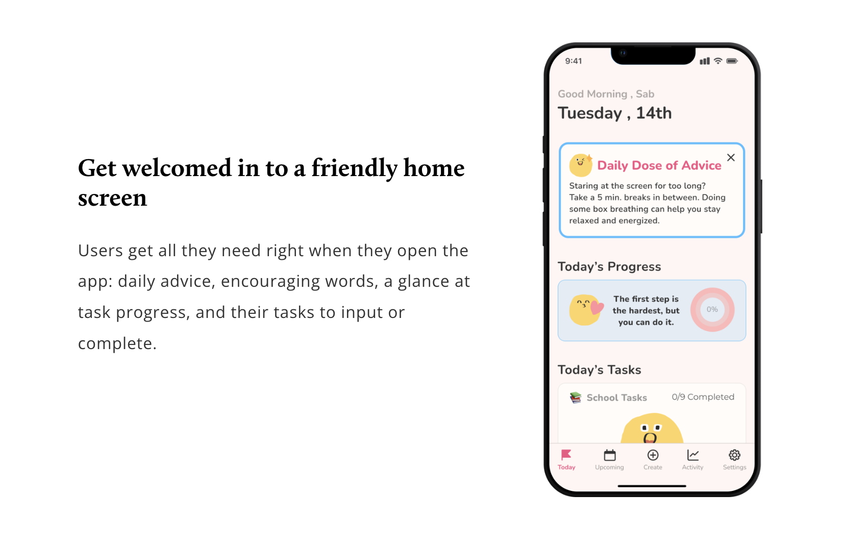
Assure the user they are doing great (not everything has to be “perfect”).
My Hypothesis
Overestimating the need for sacrifice:
Sacrificing personal time for academic success is what students think they need.
Academic year = the belief of not enough time for personal needs or desires.
End Result
Final design showcase
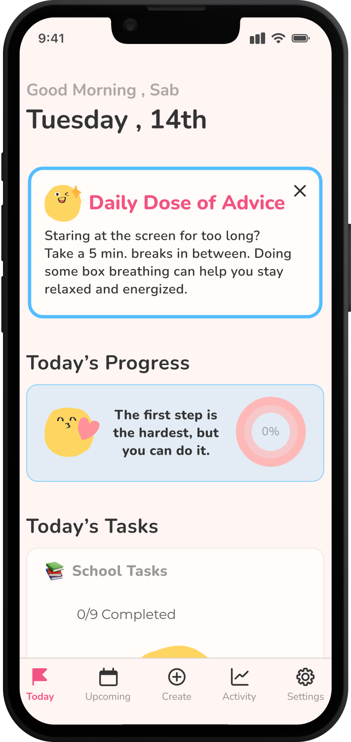
In 13 weeks I was able to research and design an app with an MVP that help met users’ needs by encouraging students to start their work sooner rather than later.
Research
To understand students' struggles with schoolwork, my research began with one-on-one interviews
I listened to 2 college students and 2 UX/UI bootcamp students. Learning about the user’s story allowed me to feel confident in pinpointing ways to help users with their needs.
Objectives:
Understand moments of student burnout, procrastination, and sacrifices.
Explore students' daily lives to understand their academic and personal challenges.
Explore students' motivations in balancing academics and personal activities.
Identify effective coping and time management methods that enhance both academic success and personal well-being.
Affinity Map
I thought it would be hard to find patterns because of the unique lifestyles each participant obtained
Truth be told, it was hiding somewhere and these patterns revealed
Key Findings:
Users experience stress and lower work quality because of their old habit of leaving assignments until the last minute.
4/4
Users feel guilty when taking breaks or personal time from school work, thinking it's essential to prioritize their personal lives.
4/4
Users often struggle with perfectionism and imposter syndrome, feeling unworthy of pride unless everything is flawless, overlooking even small achievements.
3/4
Key Insight:
Students have the habit of doing work last minute. This repetitive cycle results in rushed, low-quality work, leading them to neglect self-care.
“I prioritize my life around school... I work on my assignment days before it is due and regret not giving myself enough time for it... I need more time and room for it”
— 4th Year College Student
After analyzing the user patterns, I learned the main user pain point was students doing school work last minute
Even though users had unique lifestyles, they shared common study habits. I recognized recurring patterns in the users’ goals and pain points and incorporated them into a user persona.
User Persona
After narrowing down the focus I wanted to take a deep dive into some psychological methods for my users
I researched psychological articles on factors contributing to intrinsic motivation to enhance users' commitment to their goals
I learned about self-determination theory (SDT) concepts, highlighting three key psychological needs: autonomy, competence, and relatedness. These concepts are crucial for our well-being and drive for independent action.
What I learned:
Satisfying psychological needs is essential for our happiness and motivation
Someone who does not meet their psychological needs can hinder goal success and have negative emotional impacts
Someone who meets their psychological needs has a better time starting their work sooner
It's vital that individuals pursuing career goals prioritize their basic psychological needs, which act as fuel for their journey
One of my inspirations for this project is a lifestyle book Atomic Habits by James Clear. I wanted to implement this into my research because the book could help with my users’ needs.
“If you can’t learn the basic skill of showing up, then you have little hope of mastering the finer details.”
— James Clear
To understand how other apps are addressing my users’ needs I analyzed 4 apps to find out common features and design trends
These apps would help users manage tasks, to-do lists, and goals more effectively by helping them organize tasks, set priorities, and achieve their goals.
How might we help users discover effective strategies to avoid last-minute work, ensuring they can maintain the quality of their assignments?
Ideate
Before conducting research, I had doubts that my topic was too broad
After conducting my research, I became confident because user needs became clear and it was easier to focus on one particular need: to prevent users from starting work last minute.
Product Goal:
Provide ways to help users and guide them to effectively manage their time between school, personal life, and leisure activities.
I decided to do the classic “solution brainstorm” method because I already had the ideas spilling out of my head
The chosen idea:
Priority System for Task Management (1-3-5 rule) with AI; breaks up the student’s assignments into small and manageable tasks.
How it will help my users:
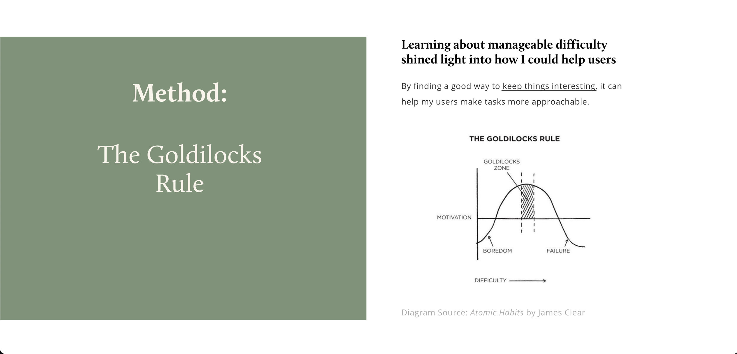
Help users tackle small chunks at a time
Help users get more accomplished in a day with set timers, assisting them to move on to the next task
Help users take breaks without guilt because they already completed some tasks.
I uncovered key emotional/procedural moments by creating the journey map before drafting wireframes
To ensure the product will run smoothly I needed to visualize the best case, ideal-state journey for a product that doesn’t exist… yet.
What I learned:
How will I know when the users are using the product? This map allowed me to see at what points will the user be off the app and to allow me to know when notifications are appropriate.
How will the product make the users feel? For instance, I can view how my product can ease user stress. When users feel overwhelmed by a difficult assignment, breaking it down into manageable tasks helps alleviate their anxiety.
Creating this map was my first time as I had not learned about it in my boot camp (Design Labs) which also meant it was going to be a bit more challenging to execute in the first go.
V2 Journey Map (future state)
Creating the journey map allowed me to see the process of how the product will go about making the app map easier to design!
Before I focused on the MVP, I laid out everything that would be in the product, which allowed me to not miss anything before I turned off the sections that would not be included in the MVP.
V2 App Map
With having done the journey map and sitemap it was relatively quick for me to diagram the user flows
Now I say that but I did have an issue; in the first iterations specifically in the “Task Initiation” flow, I did not mark areas where the user would be “on” or “off” the app. This is crucial because I need to let the users take breaks and send them notifications.
Design Phase
Sketching and wireframes
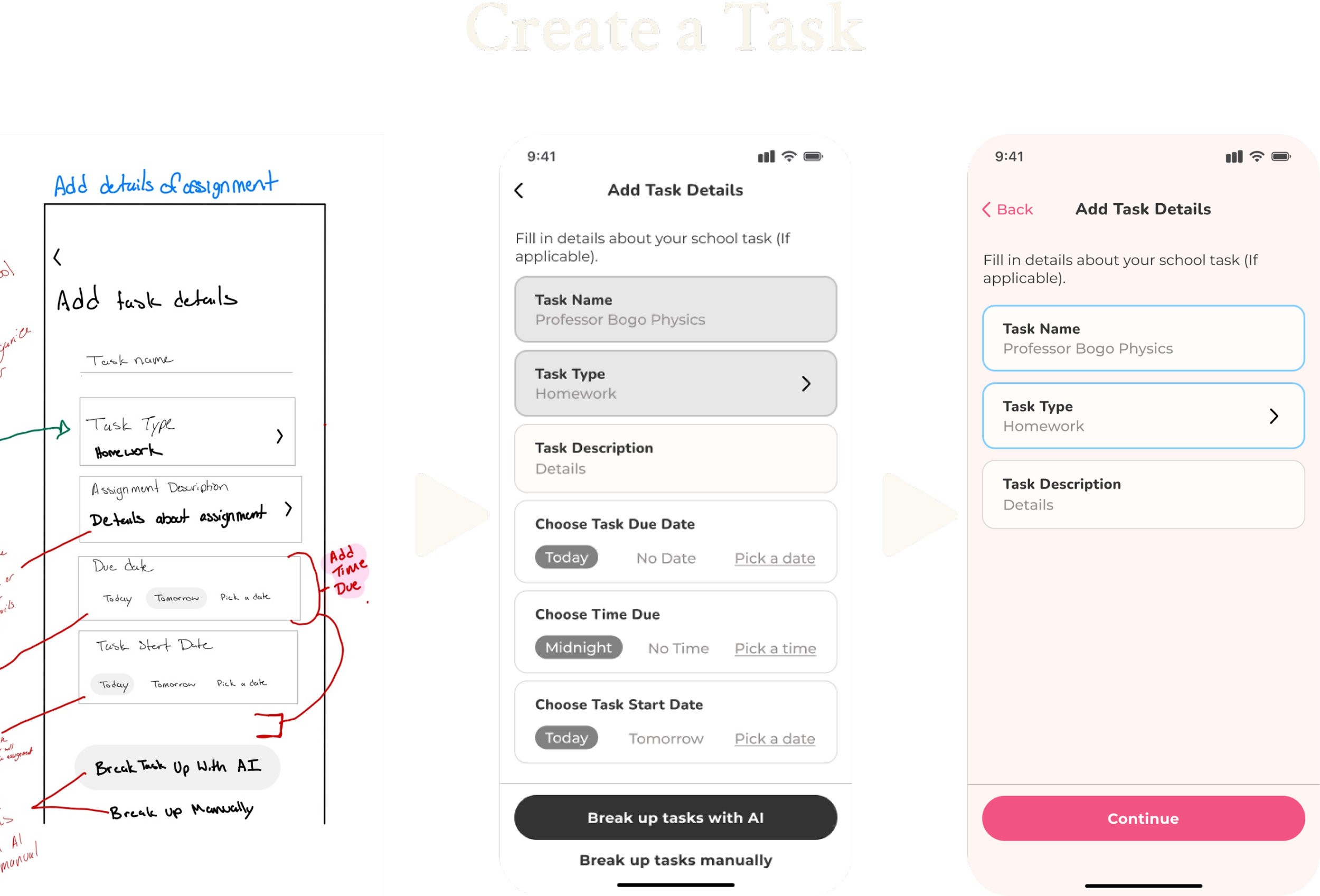
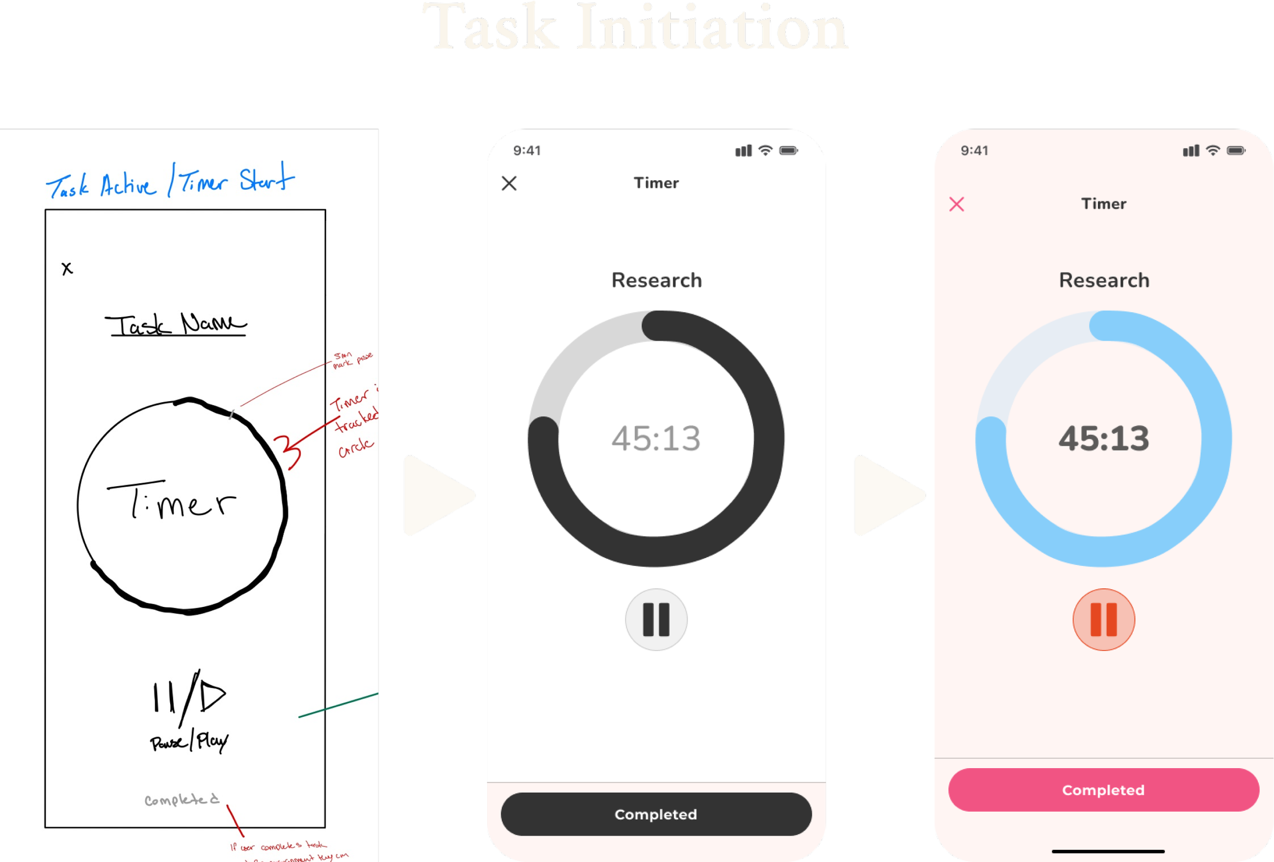
I created low-fi wireframes, then mid-fi wireframes, then finally high-fi wireframes.
Most of the competitor’s designs I looked at were too simple, and a bit serious. I don’t want the users to feel “timid” every time they hop onto the app
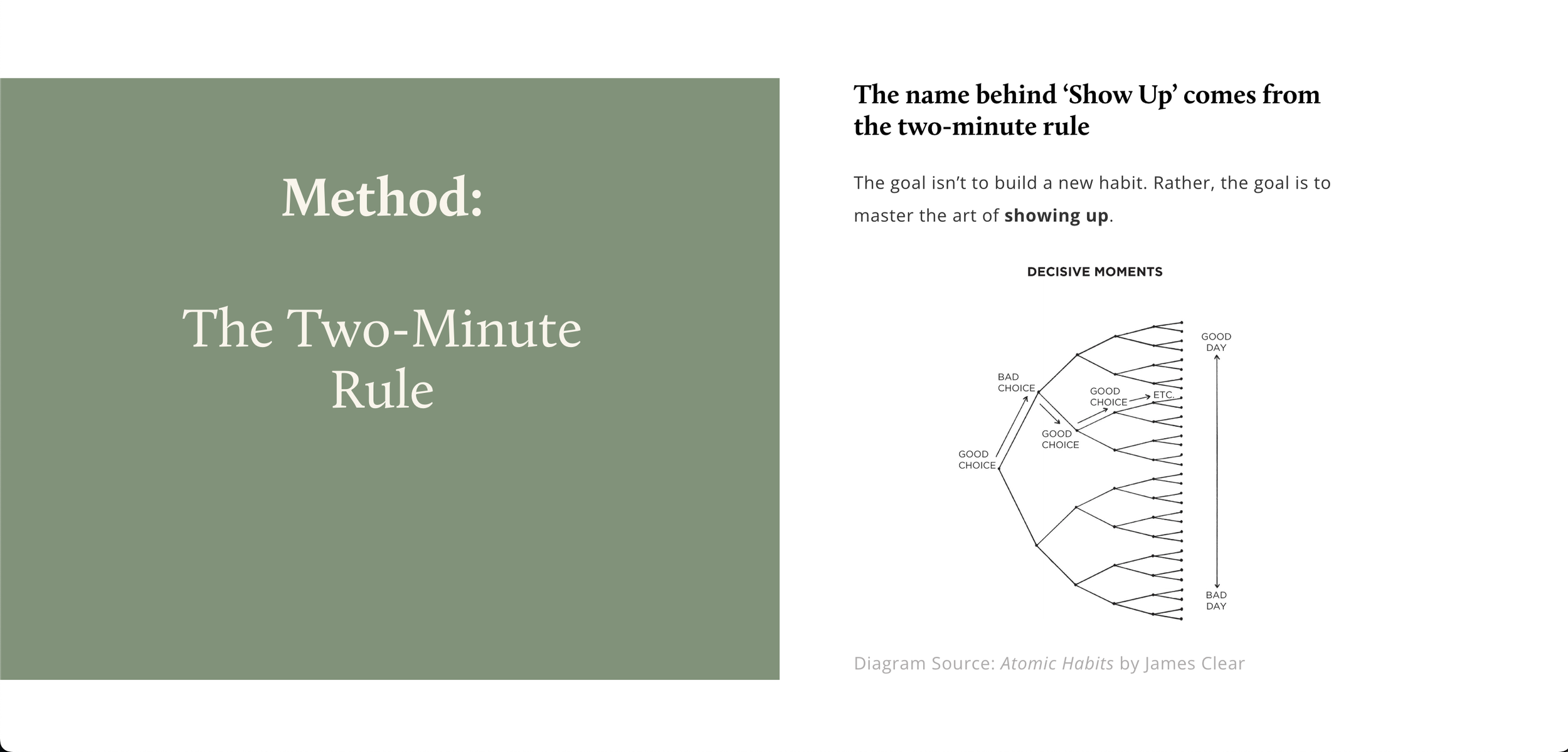
One feature such as the notification encourages users to “show up” for a few minutes, which was of course influenced by the book Atomic Habits 2-minute rule
Extending the “h” out partially wrapping around the “o”. This was inspired by this brand design.
The curves and the thickness make the logo feel friendly, easygoing, and focused.
I guess you could say like a big fluffy bear.
I decided this to be the logomark because it seamlessly blends into the brand name
Just by the looks of it, it makes sense because it looks like a person’s head with their hands up, expressing they are here, hence “Show Up”.
Based on color theory my goal was to make my users feel motivated, focused, calm, and less serious. These meanings lead me to the color of blue
After experimenting with numerous color combinations with blue, and thanks to the 'Coolers' app, a color pairing generator app, it helped me pair blue with a complementary shade – pink.
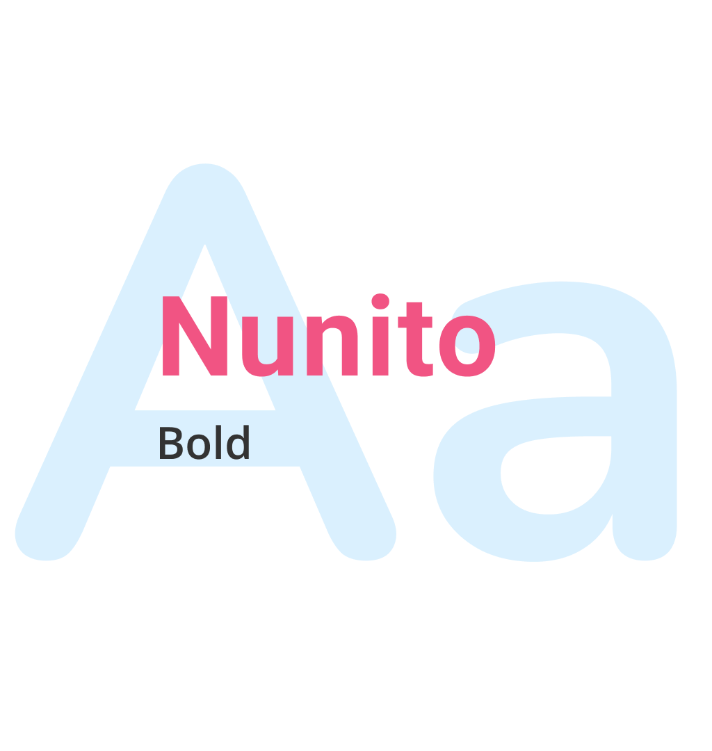
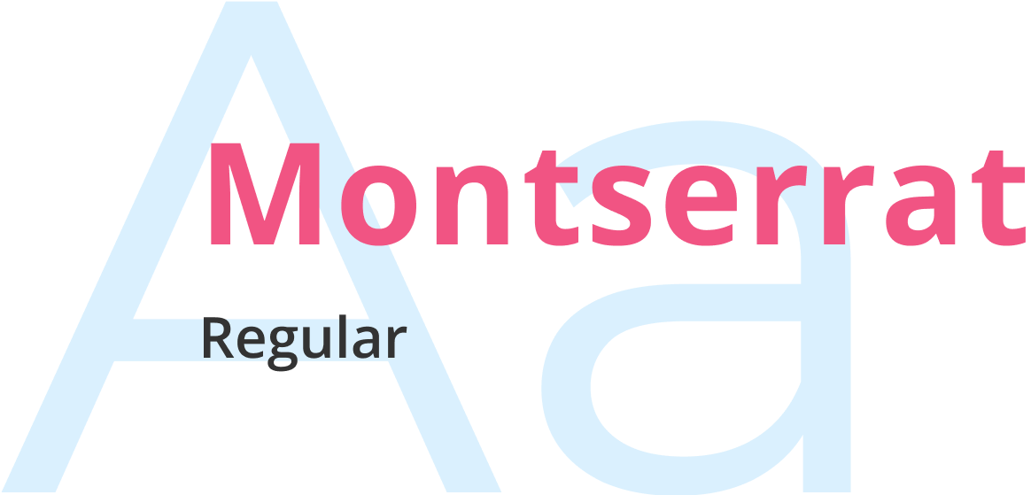
To pull a bit away from the playfulness, I looked up what pairs well with the font “Nunito,” and “Montserrat” poped up
I decided to go with the font type “Nunito” because, from the shape of the curves, it looks soft and playful.
I agreed with the suggestion of Montserrat with Nunito because it is more minimal, slim and spaced out then Nunito is.
Testing
I was so focused on the first 2 tasks I neglected the last task which resulted in a high failure rate
Issues I noticed:
1. Users running into walls
It took users more than one try to get to the actual location. Some users wanted to tap on the reminder cards from the home screen but weren't able to because it wasn't related to the reminder stated.
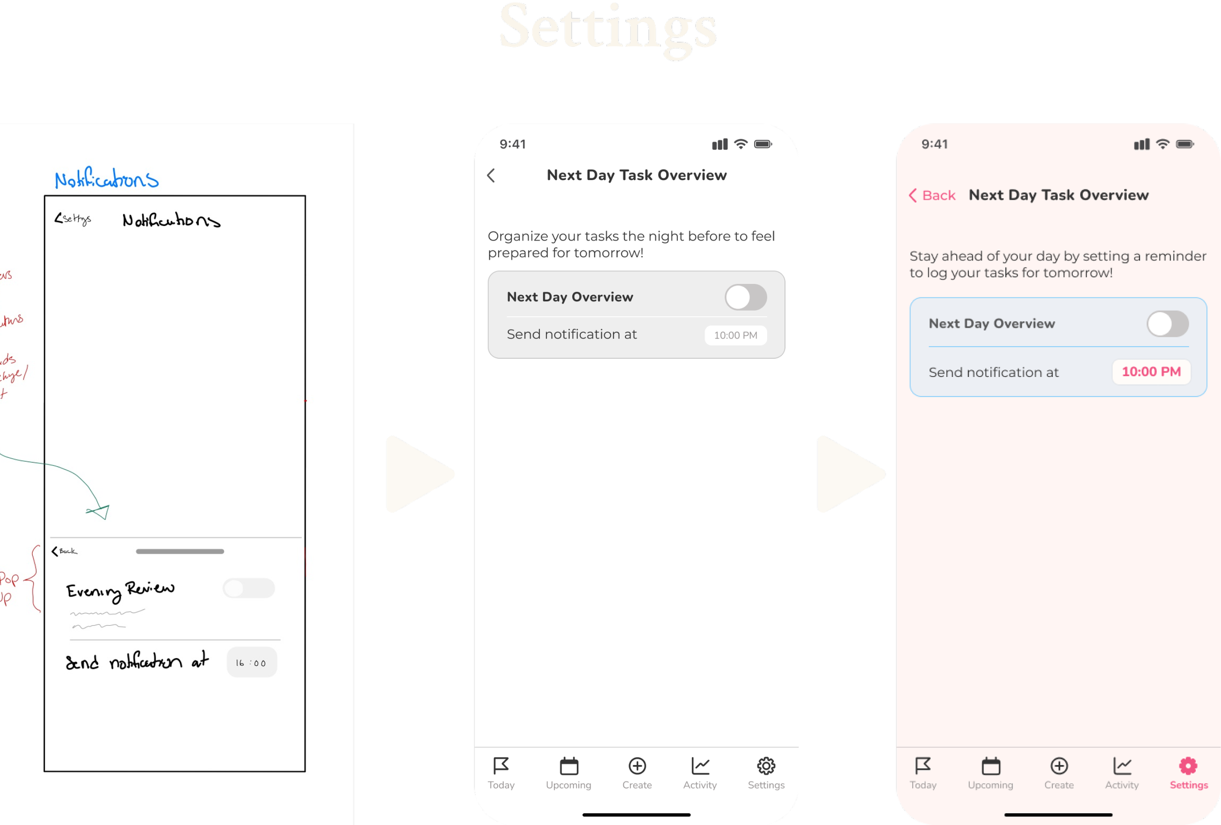
2. Uncertainty in the settings
The purpose was not clear enough as to why the user would have the “need” to put this reminder on. There was not enough information throughout the task to cue the use of the reminder.
Usability testing was a great opportunity to reveal questions that led to new ideas and tiny problems that needed improvements on
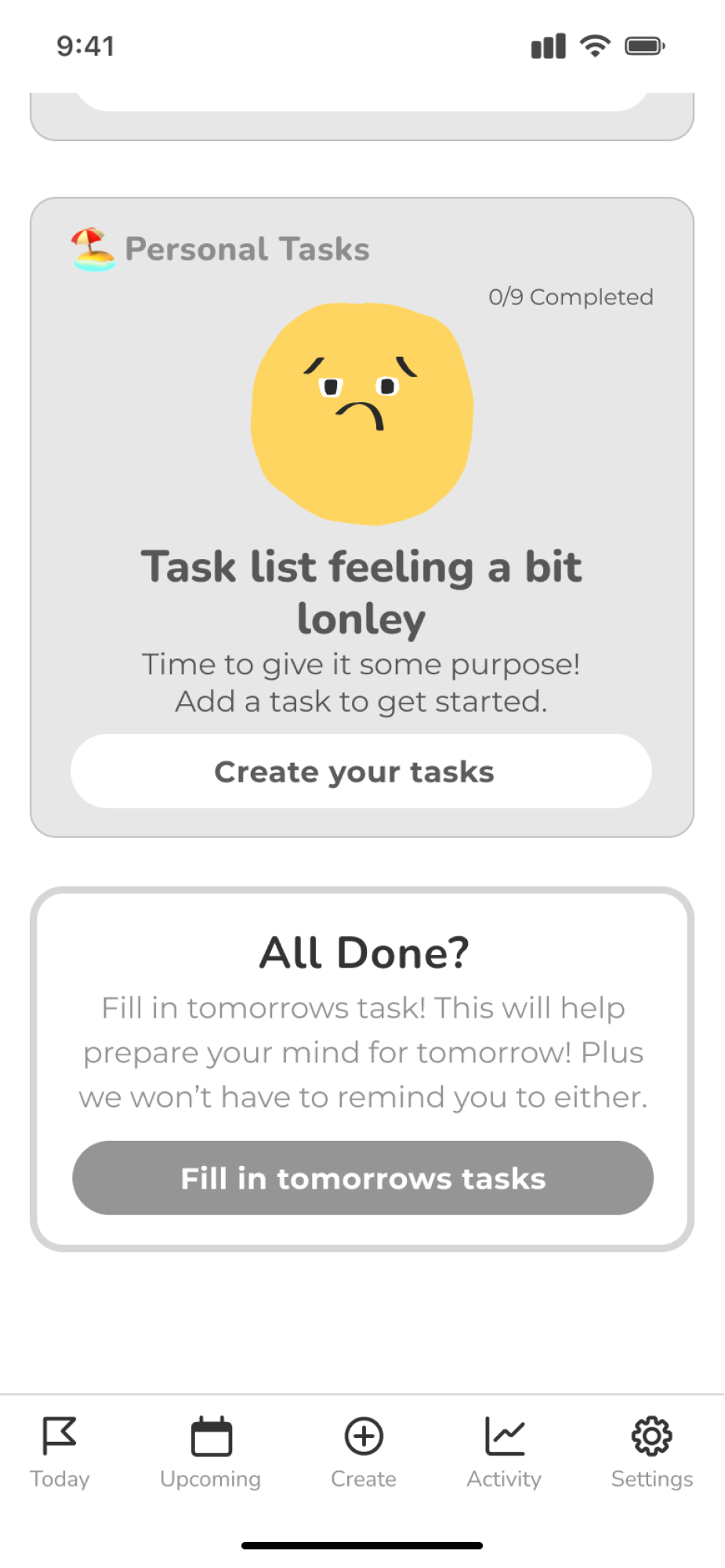
Make the reminder card useful
Issue
2/5 users from the home screen attempted to tap on the reminder cards thinking it would lead them to turn on the reminders.
The card didn’t lead to anywhere
The card was vague
Fixes
Added 2 cards total
Cards function to direct them to ‘Reminders’ in ‘Settings’
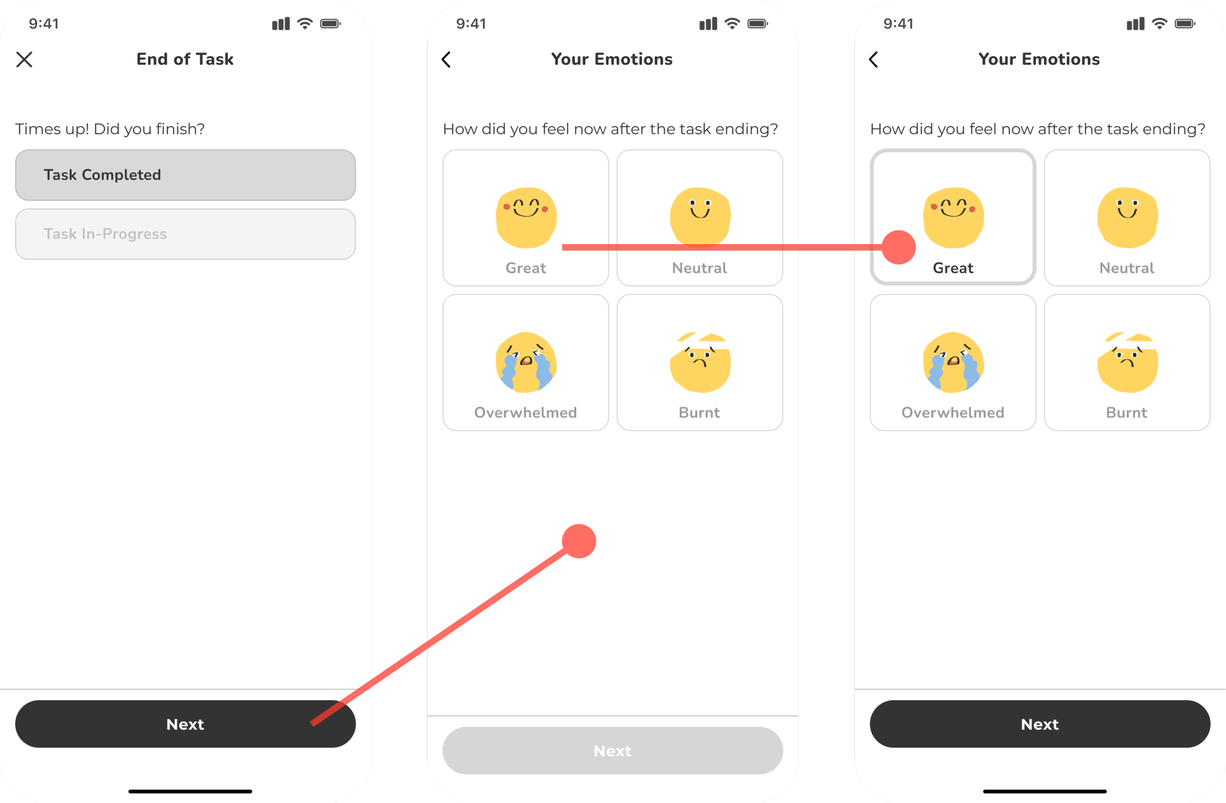
2. Feed AI more info to learn about the user
Issue
3/5 users found that this section could have a journaling section or section to ask the users how they feel in more depth
Just asks users how they feel by using the buttons
Information is too vague
Fixes
Expanded on the information
Added a ‘Notes’ section for users to be able to add in details about their experience with AI learning process
Add another frame to ask users about their task experience
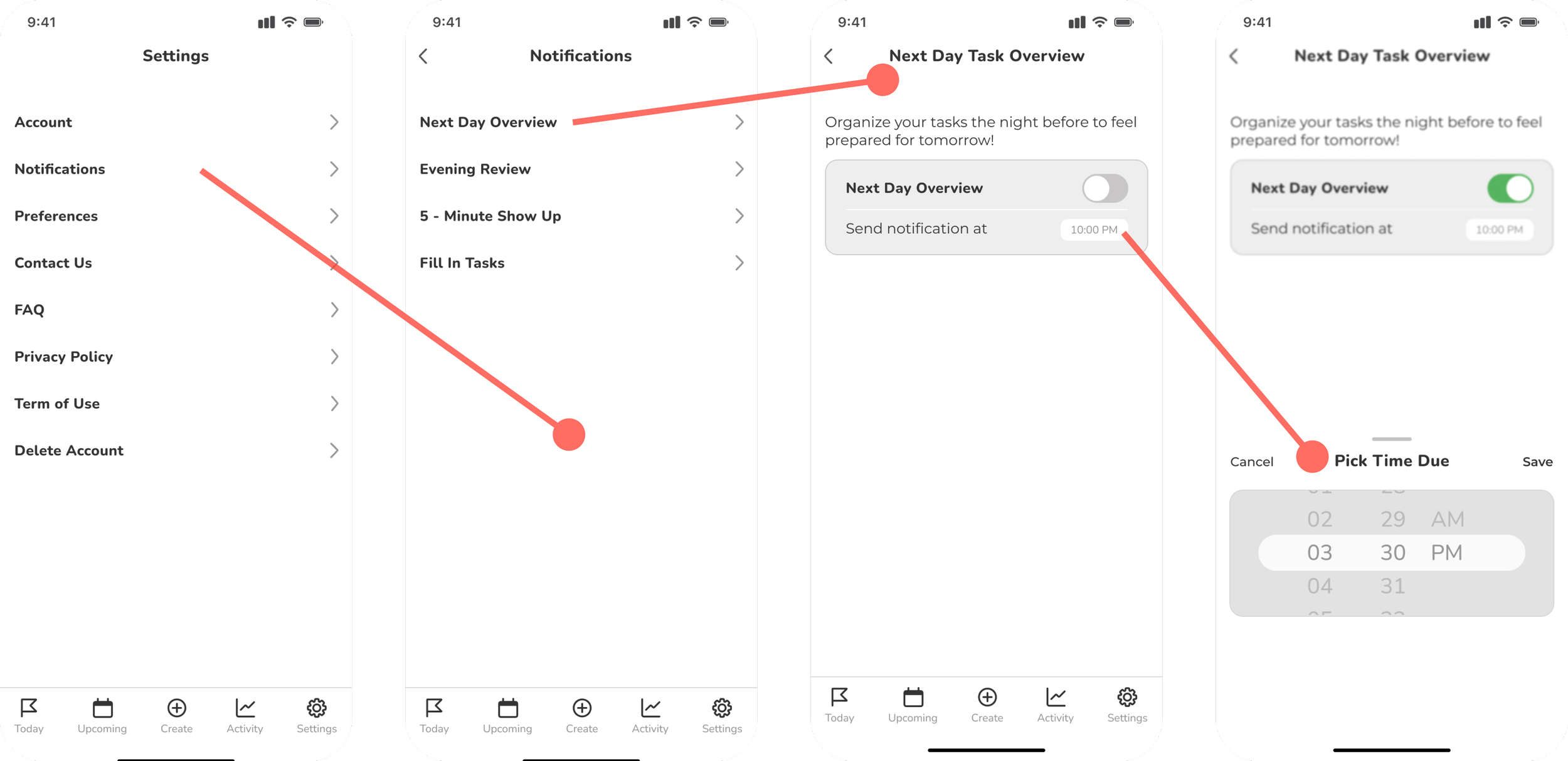
3. Settings was hard to understand
Issue
4/5 users were confused and needed more information and details about these reminders
Vague
The card is too close to the text
Not spaced out enough
The text size for ‘Time’ is small
Fixes
Contents are more spaced out
Titled the back button
Expanded the titles with information text
Making it more clear and easy to understand
Reflecting
What I learned
Broad topics need lots of research
If I hadn't done prior research before my user interviews and again after the interview I
Helped to narrow the idea down a lot easier
The research helped me step away from the solution and to understand the people before putting a product in their face
Design References
Feeling more comfortable around copying designs from other peoples work
Reference common design work, don’t have ot invent the wheel
More deliverables to narrow down ideas to achieve product goal
I originally had so many ideas and solutions to my user’s problem.
Having many deliverables done and research allowed me to pick one goal that will meet the user’s need more beneficially
As much as it was hard to stick to one idea it allowed me to focus on just one idea instead of meeting so many idea/solution expectation

